There are all kinds of techniques for creating a great presentation and just as many ways to ruin one.
Here are 9 common slide habits that may lead to presentations that fall short of the mark.
Taken individually none of these are fatal, but each takes away from the effectiveness of your presentation and the impression you make on your audience.
You won’t always be able to eliminate all of these from your presentation decks. There may be constraints placed on you by event organizers, company culture, personal preference, and by time and budget.
But in general, each of these is a speed bump on the road to a smooth, persuasive presentation.
1.The “Handshake Slide” (And Other Stock Photo Clichés)

Audiences have had enough of cliché stock photos. They are bombarded with these in advertising and marketing every day.
In the business world, some of the most common of these include the handshake to indicate a partnership or a mutually beneficial deal, a group of hard-working smiling people around a conference table to demonstrate collaboration and teamwork, and people huddled together looking at the screen of a laptop to indicate sharing of information.
There are literally hundreds of millions of photographic images available online that would better serve your presentation than a cliché stock photo. You can use scenic images, historical images, images from sports, theater and the arts. There are many inexpensive stock photo sites offering images that can help you go beyond these clichés.
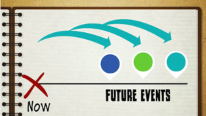
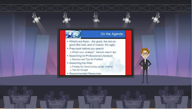
2. Agenda Slide
When you sit down to craft your presentation it’s only natural to think about your agenda, what you intend to pass on to your audience, what subjects you intend to cover and so on. But the “traditional” agenda slide can be unnecessary administrative clutter in your presentation.
Instead of showing the agenda, you can say a few words about what the audience should expect from your presentation. But as a slide, the agenda is a dull beginning that will lose people from the start.
Sometimes, having an agenda slide is part of your organization’s culture and it’s unavoidable. If you need to use one, keep it simple with minimal text, and fill in the details verbally.
Here is an example of an agenda slide from Garr Reynolds (Presentation Zen) that I like:
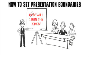
3. Housekeeping Slide
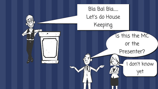
Another showstopper is the housekeeping slide. Housekeeping is content unrelated to your topic that you or someone else feels the audience should be aware of.
Housekeeping items include the conference or event schedule, announcements of prize giveaways, and encouragement to fill out an event survey.
You were no doubt invited to speak before your audience because of your expertise on a particular topic. You are there to inform and inspire. Churchill never started a speech by telling people to enjoy the buffet afterward.
In a conference, leave the announcements to the MC or to the host (unless you are the MC). That’s not your job. It distracts people from your key message and diminishes your stature as a respected leader and authority.
4. The “Eye Chart” Slide
We’ve all seen slides with too much information on them. To mitigate this, some presentation experts offer guidelines about the number of words or number of bullet points, or length of sentences on a slide.
An overly dense slide will overwhelm your audience and be difficult to present. The key is not to use arbitrary rules but to keep your slides clean, simple, and uncluttered. Step back and look at your slide from the audience’s perspective. If it looks to you like there’s too much on it, fix it.
Slides should serve as backdrops for your presentation, providing visual support. No one expects the entire presentation to be printed on the slides. If that were the case, you would not need to show up.
I have even heard presenters introduce a slide by saying, “I apologize, this one’s a bit of an eye chart.” If you find yourself saying this or thinking this, it’s time to reduce your slide content to the bare essentials.
Exception below:
In some technical presentations, the slides are used as a report afterward. In those cases, you get some leeway on the amount of information on the slides. Don’t apologize for it. Just make sure you guide the audience through the slide content, and make them aware of the key points to pay attention to.
With that said, don’t use the “technical presentation” as an excuse to be lazy. I come from an engineering background, and I know that it only takes a small amount of effort to streamline your data if you choose to.
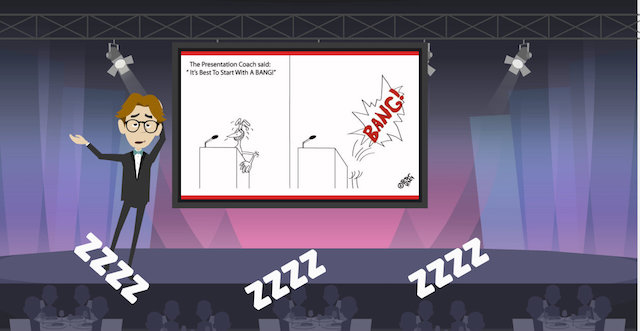
5. The Cartoon Slide
In most cases, your audience will probably have a good sense of humor. Humor is a great way to connect with an audience and put them at ease. Well-placed humorous remarks can also help relax the audience and the speaker.
There is often the temptation to add a captioned cartoon to a slide to use humor to make a point in the presentation. While there are people who will be amused by the cartoon, it can land with a dull thud for others.
It’s also a little inauthentic. The cartoon doesn’t showcase your sense of humor as much as it does the person who created the cartoon. Think about ways to introduce subtle, appropriate, inoffensive humor in your remarks and anecdotes, and you’ll both inform and entertain your audience. (And remember, use of a cartoon without permission could be a copyright violation.)
6.The “Bumper Sticker” Slide
I’ve seen hundreds of business presentations with what I call the “Bumper Sticker” slide.
This is a slide covered with dozens of logos flashed on screen with no comment or context for the audience.
The logos are intended to represent a company’s customers, clients, partners, etc. The more logos, the better, and the better known the logos, the more impressive the slide.
The problem with this kind of slide is it contains nearly no information on its own. The audience doesn’t gain any understanding of why these companies do business with your company, what value they realized from doing so, what problem you solved or what need you filled.
Instead of a wall of logos with no context, it’s better to present a few key customer examples or testimonials with details on why they chose your company that might resonate with your audience who are considering doing the same.
At least do the following:
At a minimum, if you’re going to use a logo slide, give your audience some context verbally, by saying something like, “Here is a small sample of our happy customers. As you can see we’ve worked with Yahoo, Google, Zendesk, Ancestry.com, and many other Bay Area organizations.”
7. Inappropriate Clip Art Slide
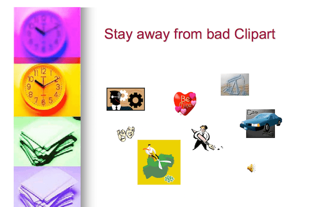
Anyone who has used PowerPoint or who has spent any amount of time on Google Image Search knows about the millions of clipart images available.
The problem is every amateur presentation designer has access to these and uses them liberally. Since they are overused, they can make your presentation look cheap or hastily assembled. If possible, use some other kind of graphical device to make your points, such as a compelling photographic image, a simple, eye-catching chart or a few well-chosen words to support your story.
Some of my clients use modern icons instead of clip art and properly used they look great. However, in a few years, these will likely go out of style as well. If you use clip arts it’s time to upgrade and if you are using modern icons be prepared to move on soon.
8. The Online Resource List Slide
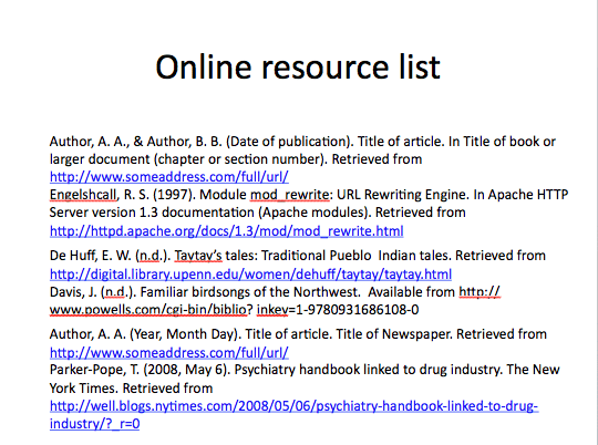
We live in both the analog and digital worlds. It’s only natural that it in a presentation there might be an opportunity to direct your audience to additional resources online that will help them learn more about your presentation topic, or yourself, or your business.
However, if you’re giving an interesting presentation and you have their attention, it is highly unlikely that they will have the time to write down or memorize a complex web address or social media identity.
If you are going to provide information of this kind in your presentation, keep to a few key resources and make sure they can be accessed simply. One way to do this is to have a simple link from a blog or website home page where you keep all these resources online and direct people to a single URL.
A long list of resources might be impressive and useful in a brochure or on a web page, but is just more distraction and more clutter in a visual presentation.
9. Lazy Title Slide
Often when developing a presentation, we start with an abstract and then move on to an outline. There might be headings such as “Introduction,” “Our Strategy,” and “Product Availability.”
Sometimes as we transition from the outline to a storyboard and finished slides in PowerPoint, these index and descriptive headings and subheadings make their way onto the slides as titles. And they make boring titles that don’t do anything to help you get your message across.
For example, instead of a slide title “Our Strategy,” wouldn’t a title like “A Strategy for Reducing Operating Costs” be more compelling? I call this making your slide titles work for you.
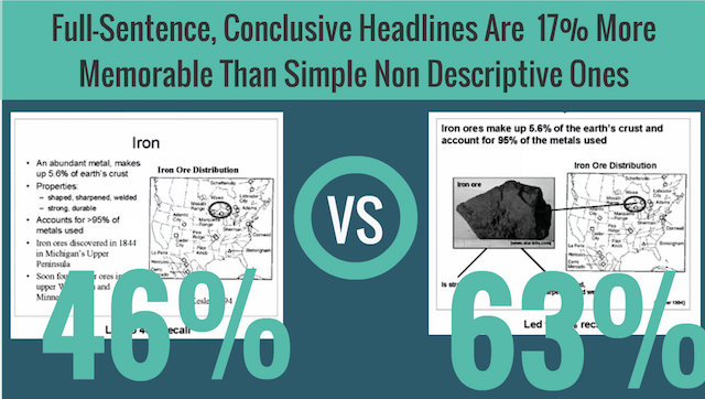
A study published in the Applied Research Journal demonstrated that a full-sentence and a conclusive headline is 17 percent more memorable than a simple non-descriptive headline.
Slide titles should be much more than descriptive index headings. They are on the slide to directly contribute to the job at hand — persuading your audience and making your message memorable.
Conclusion
These are just a few items that can be removed from a presentation to make it more effective.
Sometimes it will make sense to leave some of them in. Generally, when you can eliminate these bad slides as you craft your presentations, you will create more effective content, make your message more powerful and improve your connection with your audience.